How to make QR codes you can actually measure
Why most printed QR codes waste their data, and how to design codes that stay editable and report real scans.
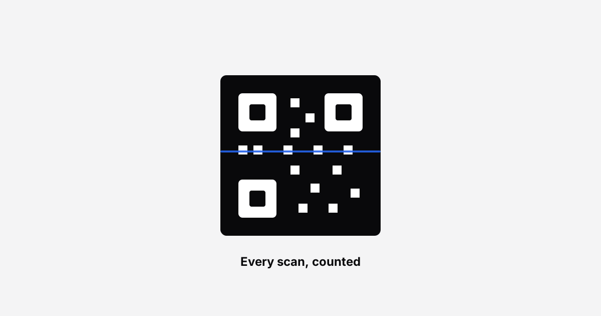
Most QR codes printed on menus, posters, and packaging are write-once artefacts. They encode a destination directly, so the moment that URL changes, every printed copy becomes a dead end. And they report nothing, so you never learn whether anyone scanned them.
Both problems have the same fix.
Encode a short link, not the destination
If your QR encodes yourbrand.com/spring-2026/menu-v3-final, that address is now physically printed on a thousand table cards. Change the page and you reprint.
If it encodes a short link instead, the printed code stays valid forever. You change where the short link points and every existing card silently follows.
This one decision converts a QR code from a static asset into something you can manage.
You get scan data for free
Because the scan passes through the short link, you can see:
- How many people scanned, and when
- Roughly where they were
- What device they used
- How scans compare to online clicks of the same campaign
That last one matters more than people expect. If the same link is on a poster and in a tweet, you want to know which one worked. Snipvio marks QR scans separately from link clicks so you can tell them apart.
Design without breaking scannability
Branded QR codes look better and get scanned more, but decoration has limits.
Keep the corner squares solid. Those three large squares are what a camera locks onto first. Turning them into decorative shapes is the most common reason a stylish QR code fails.
Keep contrast high. Dark modules on a light background scan from further away and in worse light. If you print small, stay near black.
Be careful with logos. A centre logo works if the code is generated at high error correction and the logo stays modest. Snipvio handles this automatically, reserving a clear area and raising the correction level.
Test the real thing. Not the screen preview: the printed piece, in the lighting where it will live, with two or three different phones.
Tell people why to scan
A bare black square asks for effort and offers nothing in return. Add a short label and scan rates climb.
Compare "SCAN ME" with:
- SCAN FOR THE MENU
- SCAN FOR 10% OFF
- SCAN TO SEE IT IN 3D
The second version answers "what's in it for me" before anyone lifts a phone.
Size and placement
- Print at least 2 × 2 cm for handheld distance. Bigger for anything read from further away.
- Roughly a tenth of the viewing distance is a good rule for posters: a code read from two metres wants to be about 20 cm.
- Leave quiet space around the code. Crowding it against other artwork hurts recognition.
- Consider the angle. Codes flat on a table are scanned at a slant, which costs you margin.
A workflow that survives contact with reality
- Create a short link for the destination
- Design the QR in a studio that lets you brand it
- Download SVG for print, PNG for screens
- Test on real phones before the print run
- After launch, watch scans and change the destination whenever the campaign moves
The printed code never changes. Everything behind it can.
Design a QR code with Snipvio. Free on every plan, and the codes never expire.
Frequently asked questions
Can you change where a QR code points after printing it?
Only if the code encodes a short link rather than the destination directly. A QR code is just a picture of whatever text it contains, so a code holding the final URL is fixed the moment it is printed. A code holding a short link stays editable forever, because you change where the short link redirects and the printed artwork never has to change.
Do QR codes expire?
The code itself does not, but the link inside it can. If the shortener behind it disables links when you stop paying, every printed code pointing at them stops working. Snipvio links never expire on any plan, including after a paid plan is cancelled, which is what makes them safe to commit to print.
How do I track QR code scans?
Point the code at a trackable short link rather than at your website. The shortener records each scan as it redirects, so you see totals without adding anything to the destination page. Snipvio counts QR scans separately from ordinary link clicks, so you can tell printed campaigns apart from online ones.
Does adding a logo stop a QR code working?
Not if you keep it small and centred. QR codes carry error correction that lets a reader reconstruct a portion of obscured data, which is what makes a centre logo possible at all. Push past roughly the middle third, or drop the contrast between dark and light modules, and scanning starts failing on older phones first. Always test a printed sample rather than only a screen.
What size should a printed QR code be?
The practical rule is about one tenth of the scanning distance. A code read from two metres away wants to be around twenty centimetres across. Printing smaller than two centimetres is unreliable regardless of distance, because camera focus and ink spread start to matter more than the design.
Start shortening for free
50 links a month, QR codes, and links that never expire.
Create your free accountKeep reading
How to get a short link with your own domain
Turn go.yourbrand.com into your own short link domain. One CNAME record, about 10 minutes, no coding. Step-by-step setup for Cloudflare, GoDaddy and more.
Why your link click numbers are probably wrong
Bots inflate link analytics more than most people realise. Here is what is happening and how to read your data honestly.